How to Use Canva to Create Graphics + Build Your Visual Brand
By Guest Blogger
June 6, 2016
What is Canva?
Canva is an intuitive online design platform that allows anyone to create beautiful graphics and documents, no matter your skill level. The beauty of Canva lies in its flexibility. You can choose from thousands of pre-designed elements or upload your own images for a truly personalised touch. It offers templates for virtually every design need:
Presentations
Blog graphics
Social media covers
eBooks
Videos
Why visual content matters more than ever
Visual design isn’t just a nice to have - it’s essential. Incorporating compelling visuals into blog posts and web pages significantly increases engagement, shares and clicks.
Studies show that:
Content with relevant images gets 94% more views than those without (KissMetrics).
Visual content is over 40X more likely to be shared on social media (Buffer).
Adding color visuals can boost people’s willingness to read by 80% (Xerox).
How to use Canva to build your brand's visual arsenal
Branded Graphics Remember when I stated earlier that I used to spend hours creating branded images for my blog posts? So, I finally figured out how to create a branded image in Canva, and use it over and over again for future images.
Product Images and Covers Yeppers, that’s right folks! I used Canva to create all of my product images and graphics that I sell from my store.
Workbooks and Lead Magnets Craft downloadable lead magnets like checklists, guides, or eBooks to enhance your website’s value and convert visitors into loyal subscribers.
Promotional materials For every blog post that I write, I tend to add a lead magnet or some type of incentive to the end of the posts. If you ever wondered what I was using to design these freebies, it is non other than Canva, my friends.
Videos Create short promotional clips for your products, services, or special offers to embed on your homepage or landing pages. Additionally, use Canva to produce video tutorials or demos, giving your audience a deeper understanding of your expertise while building trust. With customizable templates, drag-and-drop simplicity, and royalty-free audio options, Canva empowers you to create high-quality videos without the steep learning curve of traditional editing software.
So peeps, my question to you is this…
Do You Want to Build A Visual Arsenal for Your Brand, Design Gorgeous Freebies and Products with Canva? Great! I created and released a workshop Canva Superstar with you in mind. Canva Superstar is a 2 hour + workshop with 8 video lessons where I show you how to:
How to choose a color palette + fonts for your designs like a PRO!
How to Design Gorgeous Blog graphics for your blog (like these) even if you don’t have design skills.
The 5 Step system that I use to design workbooks that I sell for profit
How to design branded graphics for your sidebar
The framework that I use to design eBook covers and more!
When designing your homepage, give some consideration to the shapes you might incorporate.
There is a demonstrated psychology behind shapes and the emotions they can evoke.Circles, in particular, elicit powerful associations to the natural world, movement, completion and wellbeing.Employing circles in the visual storytelling of your brand can heighten the connection and positively influence the perception a visitor experiences of your website.The absence of sharp edges make the circle a welcoming shape that invites users in.Adding a circle framed image can effectively create a homepage design element that presents both a strong focal point and a meaningful object.
You can easily create circular frames for images using the free graphic design tool Canva.
Watch the video to see how!
[video width="1482" height="1024" mp4="/custom/wp-content/uploads/2019/05/Create-Circle-Frame.mp4"][/video]
Your website serves as the digital face of your business, playing a critical role in converting visitors into customers. However, as technology and user expectations evolve, many websites fall behind, becoming outdated in design, functionality and content. If your site is no longer driving traffic, engaging visitors or converting leads, it may be time for a revamp. Slow load times, poor mobile responsiveness, outdated visuals, or declining search engine rankings, suggest that your website may no longer meet the needs of its audience. Identifying these signs early helps ensure your online presence stays competitive and aligned with your business objectives.
Does your website need a makeover?
Ask yourself these four questions to get a clear sense of whether your site might need a revamp.
1. Is your website mobile-friendly?
Mobile users expect a seamless experience. No one wants to deal with a website that forces them to pinch and zoom, struggle with desktop-only menus or wait for slow loading pages. Poor coding, tiny text, and sluggish performance can quickly frustrate users, causing them to abandon your site before you even have a chance to engage them. A mobile-friendly site is essential for retaining visitors and turning them into customers in today’s mobile-first world.
One tool that can help diagnose and improve a slow-loading website on mobile is Google PageSpeed Insights:
Google PageSpeed Insights analyzes your website's performance on both mobile and desktop devices. It provides a detailed report on factors affecting load time, such as image optimization, caching, and JavaScript, along with actionable suggestions to improve speed.
2. Is your website design up-to-date?
Design trends and user expectations are always evolving, and your website should evolve with them. A modern, up-to-date design is key to presenting your company in a professional and trustworthy light.
Current website design trends emphasise minimalism and the strategic use of white space. Minimalism simplifies design by focusing on essential content, reducing visual clutter and distractions. While white space enhances readability by guiding a users' attention to key elements. Together, these trends foster a clean design that feels less overwhelming and promotes a streamlined, user-friendly interface.
A visually appealing layout, combined with user-friendly navigation and a welcoming feel, creates a positive first impression and helps build customer trust. Keeping your design fresh not only enhances the user experience but also reflects your brand's commitment to staying current and competitive.
3. Is your pricing page easy to understand?
Creating a converting pricing page for your membership website requires clarity, transparency, and an engaging presentation. Start by clearly presenting each membership tier and listing the features that each plan offers. Use concise, compelling language to convey the member benefits, making it easy to compare options. The primary goal of a pricing page is to encourage visitors to subscribe to your membership website. Don’t include links or other elements that lead away from the conversion path.
Incorporate a testimonial banner to build trust. Ensure that your call-to-action buttons stand out and guide users toward the sign-up process. By prioritizing user experience and highlighting the advantages of your memberships, you can design a pricing page that effectively converts visitors into loyal members.
4. Do you have any errors or outdated information on your site?
A website with incorrect details, broken links, or outdated content can quickly turn potential members away. Broken links or missing images are not just frustrating; they can make your site appear neglected. If visitors sense you’re not maintaining your website, they’ll be far less likely to subscribe or engage. Regularly reviewing and updating your site is crucial for showcasing your professionalism and building trust with your audience.
Check if these pages and links need an update:
Are your contact details still accurate?
Is your "About Us" page current?
Are your social media links still functional?
Why a clean website design shows commitment
Revamping your membership website design is crucial for and staying relevant and competitive. A modern, intuitive design can attract new members and retain existing ones by making it easier for users to access valuable content. An updated design reflects your commitment to delivering a high-quality user experience, showing members that you prioritise their needs and satisfaction.
First impressions are crucial to preventing visitors from ‘bouncing’ off your website. You literally have less than 3 seconds to convince a first time visitor to scroll down. And your website’s design plays a major role in how your website is judged in those critical first seconds.
The importance of a well-designed website can’t be overstated. A professional looking website design instills trust and credibility and can make a difference in attracting and retaining customers.
Your website's design needs to be clean, user-friendly, secure and mobile friendly.
In order to deliver a visually appealing, user-friendly and effective website it’s key to make sure your website delivers on these five elements.
1. Follow current design trends
Following current website design trends is a strategic choice for projecting a professional and relevant image to your audience. It signals that your brand is modern and forward thinking.
By incorporating the trending minimalist style, your website will be clean, uncluttered and easily navigable to visitors.
Website owners often mistakenly believe that ‘everything’ must be presented on the homepage. In fact, the exact opposite is true.
Having a lot of content on a website homepage overwhelms visitors making the page cluttered and difficult to navigate.
Visitors typically spend only a few seconds scanning a webpage. The consequence of an overloaded page is that users may struggle to process the information. This can lead to decision paralysis and page abandonment.
Mobile users, in particular, find it challenging to navigate a homepage with excessive content which can result in excessive scrolling.
Your homepage should provide a clear and focused introduction to your brand, its products or services and key calls-to-action. Too much content dilutes this focus making it harder for visitors to understand the main purpose of the website.
Instead of overwhelming visitors with an abundance of information on the homepage, it's best to prioritize clarity, simplicity and ease of navigation. Focus on highlighting key information and calls-to-action that guide visitors toward their intended goals. Save detailed content for interior pages. Let your users decide if they want to explore more.
Font choice plays a multifaceted role in delivering both readability and brand identity to your website design.
Every font presents its own distinctive visual aesthetic. So it’s important to carefully choose a font that matches the character of your website. For example, a playful, rounded font like Quicksand suits a website targeting children while Roboto’s lean, condensed proportions is often chosen for fitness websites.
Another important factor in font choice is ‘readability’. Select a font that is easy-to-read across multiple screen sizes. Sans-serif fonts are generally preferred for online readability.
Use a limited number of fonts. It’s recommended not to use more than three font types on a website. Choose a primary font for body text and a secondary font for headings. Having a clear distinction between these two fonts helps establish hierarchy and enhances readability.
Font consistency is another mark of professionalism in website design. Uniformity in font choices, sizes, styles and colors establishes a clear visual hierarchy to your content. It fosters readability and guides readers seamlessly through the content.
3. Use videos to boost engagement
Videos are an impactful medium to incorporate on your website homepage. They are proven to capture a visitor’s attention more effectively than static images or text.
Videos draw users in and encourage them to stay longer. They can provide a visual demonstration of your offering and create a memorable first impression of your product.
Including videos can also have SEO benefits. Search engines often prioritize websites with video content in search results. Additionally, videos often encourage visitors to linger on a page.
The length of time a user spends on a web page, known as "dwell time," can have significant SEO impact. When a user spends a longer time on a web page, it signals to search engines that the content satisfies the user's query or intent. This will improve your web page’s ranking.
Your web pages should be fast loading. A slow website affects user experience and can result in page abandonment.
The likely culprit of slow loading pages is often the presence of large file sizes of images, videos and other media. Compressing images and optimizing media files for the web can help reduce file sizes and improve loading speed.
Your navigation menus should be touch-friendly and intuitive across devices. Utilize mobile-specific navigation patterns such as hamburger menus, collapsible sections, and sticky headers to conserve screen space and simplify navigation.
5. Present a secure website
Visible website security significantly influences the first impressions of visitors. Websites that appear unsecure erode trust and lead visitors to swiftly bounce away.
Conversely, a website displaying tangible signs of security sends a clear message of reliability and commitment to user safeguarding.
A site secured by https encryption, an SSL certificate, displaying a privacy policy and transparent opt-out cookie policy fosters user confidence.
It informs the visitor that you take your commitment to their data protection and privacy seriously.
Conclusion
Designing a professional-looking website involves a combination of thoughtful planning, attention to detail and adherence to best practices. By following these five tips, you can create a website that functions effectively, engages users and establishes credibility.
It's time to build your membership website
Book a demo and see everything that's possible with SubHub.
Niche content membership websites have become an increasingly popular means for individuals with specialist knowledge to offer exclusive content, build a community and generate revenue. However, despite the potential for success, many membership websites fail to achieve their goals.
Before launching your membership website, it's crucial to understand the typical reasons that lead to failure. By identifying these stumbling blocks, you can take proactive steps to avoid them and increase your chances of building a successful online business.
In this article, we identify into the top ten reasons why membership websites often falter. We examine each failure point, and present you with knowledge and strategies to overcome them and position your membership website for long-term success.
1. Lack of clear value proposition
What do members get out of joining your site? If you can't answer this question clearly and concisely, then you're going to have a hard time convincing a visitor to become a member.
Without communicating a compelling and distinct value proposition, your membership website will struggle to attract and retain a loyal user base. Here's why a clear value proposition is crucial for a successful membership website:
Differentiation: A clear value proposition sets your membership website apart from the competition by highlighting its unique benefits and value.
Member Motivation: A well-defined value proposition addresses the needs, desires and pain points of your target audience. It demonstrates how your platform can provide solutions.
Clear Communication: Your value proposition should be concise and easily understandable ensuring that potential members quickly grasp the essence of your membership website.
Conversion Optimisation: Value propositions that are well crafted and persuasive can significantly impact conversion rates by effectively persuading visitors to become paying members.
Tip: You can strengthen your value proposition by defining your customer persona. Through understanding your customer persona, you're able to identify and address their pain points in your messaging. This lets you position your membership website as a solution provider and can enhance its perceived value.
2. Poor quality content
High quality content is the lifeblood of any membership website. It's what keeps members engaged and coming back. Regularly updated and relevant content creates a sense of anticipation, value and exclusivity. It increases conversions. When people find your content to be valuable, they are more likely to take action, such as signing up for your newsletter or purchasing a product.
By delivering content that addresses member pain points, educates or provides insights, you reinforce your value proposition and build trust.
Compelling content helps differentiate your membership website from its competitors. By offering niche content, you can carve out a unique position in the market. This differentiation enhances the perceived value of your website and gives members a reason to choose and stay with your platform.
Quality content also helps to drive traffic to your website. When people find your content to be informative and helpful, they're more likely to share it on social media. Other websites will reference it and these backlinks will improve your search ranking because Google then sees your site as a trusted authority on your subject.
Tip: By creating content that targets relevant keywords, you increase the visibility of your website in search engine results. This can attract new members who discover your content through organic search, expanding your potential audience.
3. No free content
The natural tendency of membership website owners is to hide all of their content behind a paywall. This is a mistake.
Every membership website should make a percentage of its content free. Providing free, regularly updated content serves several purposes:
It drives organic search traffic and shares.
It builds trust with visitors by sharing valuable content for free.
It enables you to establish authority and credibility on your topic.
It gives visitors a reason to return or sign up for a newsletter.
Offering free content is a powerful marketing tool. It demonstrates the value and credibility a membership to your website provides. It's a powerful tool to attract, engage, and convert visitors into paying members.
4. Bad user experience
Design is important.
You only get one chance to make a first impression. In fact, statistics report, you have less than 6 seconds to make a positive impression that convinces a visitor to scroll. A membership website that is difficult to navigate, has slow loading pages or lacks intuitive features can quickly turn off users. Frustrating user experiences can result in high bounce rates and low member retention.
There are many membership platforms to choose from. Do your research and find one that fits your needs and has excellent customer support.
5. Complicated membership options
Complicated membership plans and pricing tiers can introduce unnecessary friction in the sign-up process. This friction delays a visitor's decision to subscribe.
Simple membership plans play a significant role in the success of a membership website. They eliminate confusion and enable potential members to make quick and informed decisions.
When presented with a limited number of well-defined membership options, users can easily understand the benefits, features and pricing associated with each plan. This transparency reduces decision fatigue, fosters trust and promotes a positive user experience that increases conversion.
Tip: Ideally, you should offer no more than three plan tiers. Each plan should offer a distinct value proposition. The benefits of each plan should be clearly listed to differentiate the levels of content access and features. When a user can quickly grasp the value proposition and pricing structure, they are more likely to sign-up.
6. Ineffective Marketing and Promotion
Without proper marketing and promotion, even the most exceptional membership websites will struggle to attract an audience.
However, you don't need a big budget to effectively promote your website just social media savvy. Before launching your website, establish yourself on the social media platform where your target audience is most active. Build an audience by regularly posting and actively engaging with your followers. Use the channel to build trust, present yourself as an authority and drive traffic to your website.
7. Lost prospects
People rarely find a website and immediately reach for their credit card. You may have to convince them over time. The problem is over 90% of visitors, even if they like what they read, will never return and will become lost prospects.
In order not to lose these potential members, your website’s number one goal should be to get a visitor’s email address. Once you have their email, you can begin to build a relationship through ongoing communication like a newsletter or special offers.
Tip: To capture a visitor's email, implement an opt-in strategy using a compelling lead magnet. In exchange for their email, offer a piece of valuable content. Your incentive could be an ebook, discount, checklist or free online course. The lead magnet should align with the interests or address the pain points of your target audience.
Place the opt-in form strategically on your website, as a pop-up or banner and clearly communicate the benefits of subscribing. Keep it simple. Ask for only essential information like a name and email address and assure them their email will not be shared with third parties.
8. No sense of community
A strong and engaged member community promotes connection, engagement and collaboration. This leads to increased satisfaction, retention and advocacy. Active members are more likely to renew their memberships, reducing churn and sustaining long-term success.
Community can be nurtured through comments, forum discussions, live webinars and Zoom classes.
Active members are also ambassadors for your website. They can drive traffic and conversions through shared posts, testimonials and reviews.
9. Limited to a single revenue stream
While membership subscriptions will form your core revenue source, additional streams allow you to broaden your customer appeal and maximise your earning potential.
Some visitors may not be ready to commit to a membership, but will be interested in purchasing access to an individual course or specific piece of content. By diversifying your offerings, you can cater to different customer preferences and generate revenue from those who aren't interested in membership. You'll also capture their email for future marketing efforts.
Creating additional revenue streams isn't difficult. There are many ways you can repurpose and sell your existing content using different delivery methods. Blog posts can be offered as pay-per-view products and paid downloads. Your video tutorials can be adapted into courses. Access to events and webinars can be sold.
10. No social proof
Websites without social proof are at a disadvantage as they lack the validation of users.
Social proof should always play a prominent role on your website as it establishes trust, credibility, and legitimacy. It leverages the influence of existing satisfied members to attract and convince new members to join.
Social proof can take various forms, including testimonials, reviews, case studies, user-generated content or social media engagement.
Tip: Make a concerted effort to get member reviews posted on a trusted review site. Open a Google My Business page and start collecting reviews.
Conclusion
Now that you know some of the factors that contribute to a website's failure, you can use this knowledge to build and grow a successful membership website.
Free membership ebook
Download our five-step guide to a profitable membership website
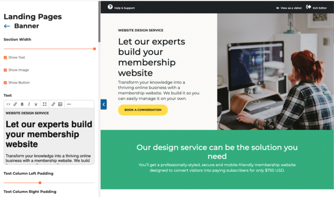
Ready to transform your knowledge into an online business with a membership website but don’t have the time or skill to build it yourself? Our design service could be the solution.
YouTube is one of the most effective platforms for attracting, engaging, and converting potential members to your membership website. With billions of users and an ever-growing appetite for video content, leveraging YouTube can help you build brand authority, drive traffic, and grow your membership.
Kate Faulkner, founder of PropertyChecklists.co.uk, has created a valuable resource for aspiring property developers and professionals. By offering an array of detailed checklists, expert advice and access to a trusted network of service
Tony Eyers launched his membership website to offer online harmonica lessons to share his passion for music while providing value to both beginners and seasoned players. By offering a combination of free content
Using a membership website to sell your online learning materials allows you to support teachers with fresh resources while generating recurring revenue and showcasing your expertise.
The principles of promoting a membership website haven’t changed much over the years. It requires innovative strategies that attract and retain paying members. What does change are the tools and tactics. In this article, we’ll talk about how to leverage the latest cutting-edge tools and trends to maximize visibility and engagement in 2025.
SubHub’s membership website builder allows you to easily build and launch your own online knowledge business and earn an ongoing income from it.
Users love all the built-in functionality, intuitive editor and 5-star customer support they receive.
The SubHub platform includes everything you need, all-in-one place, to create a website that can accept payments from users who subscribe to gain access to your member-only content. It delivers all the functionality to succeed in creating any type of membership website. Get started building your site with our free 14-day trial.
Easily customise your homepages to convert visitors to members
After selecting one of our ready-made homepage templates, you can easily customise it to suit your brand and content. You can delete any unsuitable section from any template and replace it with one relevant to your design. A large selection of layout options can be found in the section’s library.
Build custom pages using the landing page editor
Our new landing page editor lets you create specific marketing pages. Depending on your hosting plan, you can create from 5 to 30 additional pages using the robust design capabilities of the landing page editor. But there’s need to be limited to using this editor just to create landing pages. You can also create highly styled content pages too.
Create unlimited membership plans and multiple levels
With SubHub, you can create unlimited subscription plans and membership levels to effectively segment your audience and the content they can access. Your members will only be able to access the content they are paying for.
Accept secure payments with trusted payment gateways
SubHub’s seamless integration with the trusted payment gateways, Stripe and PayPal, lets you securely accept recurring and one-off payments from members for subscriptions and course and store purchases. SubHub does not take any percentage of your sales. You can offer discounts, free trials and set up automatic renewals.
Easy to use content management system
Easily create and organise your content using the CMS. Your pages can contain images, audio, videos, PDFs and more. It can be published to be viewed publicly or access can be restricted to members only and even members who purchased specific subscription plans.
Create and sell unlimited online courses
Selling online courses are all the rage. With SubHub’s course editor, you can quickly create courses to sell as individual products or to include as part of a paid membership plan. Start transforming your knowledge into an income stream!
Check out the course sales page design on STEMsmart which lists all their educational courses for preschoolers.
Sell store products for an additional revenue stream
The built-in store lets you sell physical products and digital downloads. With the pay-per-view functionality, you can sell access to one off member-only content.
LovePrayTeach uses their store to earn additional income by also selling their member content as individual downloadable lessons.
Grow and nurture your online community
Grow your community engagement with features that promote communication. SubHub’s built-in member forums, commenting, event calendar and member profiles help to foster member participation.
Translate your website labels into your language
The language settings menu allows you to translate any hard coded English word into the language of your choice. Alternatively, you can replace a word with your own alternative.
Our advanced search filter lets students find the perfect fitness class
SubHub's advanced search filter lets your students customise their search experience so they can find the most suitable fitness or yoga class that meets their specific criteria at any moment.
The advanced search filter is available with every SubHub website. You just need to enable it in the control panel.
A 5-star support team that always exceeds expectations
Our team delivers personalised support and always goes above and beyond client expectations. We don’t send scripted replies but thoughtful information along with screenshots and bespoke video tutorials so you always feel comfortable and confident using the SubHub platform. Our support team never receives anything less than 5-star reviews.
Take a tour of SubHub's membership website solution - see everything that's possible and more
https://youtu.be/n6ISbNCMeEI
Need help building your website? Our design service could be the solution for you!
Your member homepage is one of the most important pages on your site. It's where members land each time they log in, and it should be designed to keep them engaged, help them easily navigate your content, and encourage them to remain active subscribers.
Resizing images in bulk is essential when optimizing photos for websites, social media, or storage. Instead of resizing each image manually, using bulk processing tools can save time and effort. This guide will walk you through three popular methods: Adobe Photoshop, Picsart, and Imageresizer.com.
1. Resizing Images in Bulk Using Photoshop
Adobe Photoshop is a powerful tool that allows you to resize multiple images at once using its Image Processor feature.
Steps to Resize Images in Bulk Using Photoshop:
Open Photoshop and go to File > Scripts > Image Processor.
Select the folder containing the images you want to resize.
Choose the destination folder where resized images will be saved.
Under File Type, check Resize to Fit and enter the desired width and height (e.g., 800x600 pixels).
Select the file format (JPEG, PSD, or TIFF) and adjust quality settings if needed.
Click Run, and Photoshop will resize all images in the selected folder automatically.
Pros: ✔ High-quality output ✔ Supports batch processing with additional adjustments (e.g., sharpening, color correction) ✔ Saves time when handling large projects
Cons: ✖ Requires a paid Adobe subscription ✖ May have a learning curve for beginners
2. Resizing Images in Bulk Using Picsart
Picsart is a user-friendly tool with bulk resizing capabilities, available as a desktop app or online editor.
Steps to Resize Images in Bulk Using Picsart:
Open Picsart (either the desktop app or the online version at picsart.com).
Click on Batch Editor in the tools menu.
Upload multiple images by selecting or dragging them into the editor.
Choose the Resize option and set your desired dimensions.
Apply the changes and click Export to save all resized images.
Pros: ✔ Simple, user-friendly interface ✔ Free version available ✔ Additional editing options like cropping and filters
Cons: ✖ Free version has limited features ✖ Web-based version may be slow for large batches
3. Resizing Images in Bulk Using Imageresizer.com
Imageresizer.com is a free, web-based tool that allows you to resize multiple images quickly without downloading software.
Steps to Resize Images in Bulk Using Imageresizer.com:
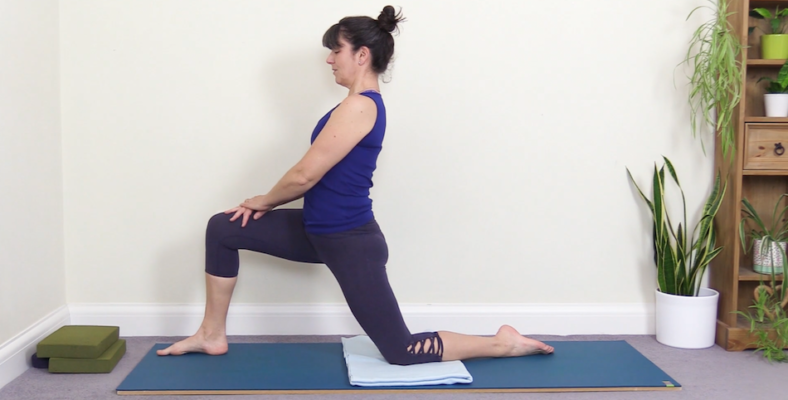
Yoga continues to thrive as one of the most adaptable and accessible fitness practices, making it an ideal discipline for online instruction. With minimal equipment and the flexibility to practice anywhere, transitioning from an in-person studio to an online membership-based platform is easier than ever.
Lower Overhead Costs – Eliminate expenses associated with running a physical studio.
Flexible Income Streams – Generate passive income through on-demand classes, memberships, and live sessions.
Personalised Learning – Provide students with an extensive library of yoga sessions categorised by style, duration, and focus, allowing them to tailor their practice.
Deborah Stanley, founder of ThriveYoga, successfully launched her online yoga studio with these benefits in mind. She leveraged the SubHub membership platform to create a seamless experience for her students. We spoke with her about her journey, insights, and tips for building a thriving online yoga community in 2025.
Can you tell us a little bit about your background and what led to you to setting up your site?
I've been a yoga teacher for 12 years and I wanted to offer my classes online so my pupils could practice at home and people who couldn't attend my in-person classes could enjoy the benefits of yoga whenever they wanted to.
Why did you decide to use SubHub and how long did it take for your website to be online?
I wanted a membership site that did everything - hosted the website, managed the members, linked to the payment method, that I could update and add to myself and offered support and back-up when I needed it.
How involved were you in developing the website, and did you have any experience in creating a website before?
I was involved in building the website from scratch and worked closely with the developers to ensure the site worked as I needed it to. I have created a very basic website for my in-person classes before.
How hands on are you with updating your site? Do you create everything yourself, do you have any staff, or do you outsource?
I create everything myself. I write a weekly blog and add a weekly video myself. I don't have any staff, except a slightly more tech-savvy and willing-to-help husband.
How much time do you spend updating your website?
I don't make many changes to it apart from writing my weekly blog and setting up my weekly video. How do you interact with members and what’s the key to keeping them happy? I keep in contact with them via my blog, newsletters and social media. A variety of different classes and different information about yoga keeps people happy, plus a smooth-running, straightforward membership process with no surprises or glitches so they can view their videos whenever they want to.
How has SubHub enabled you to grow?
I am able to teach yoga to many more people than I could in my in-person classes and potentially make more money from doing so.
What kind of content is most popular on your website and why do you think that is?
The videos - people join Thrive Yoga to practice yoga with an experienced teacher who offers varied classes suitable for all abilities.
How have you grown your email subscribers and how do you manage them?
I have not done much advertising yet but some members have found me through word-of-mouth, the Thrive Yoga Facebook page and Google search. I manage them via Mailchimp.
How important is your website for your business?
My website IS Thrive Yoga. Without it I can't offer the videos or the membership.
Now that you've created a website, how do you make money from it?
I sell a monthly membership package.
From your experience, what are the basic steps somebody needs to take to setup and develop a successful website?
Help from an expert - it is extremely time-consuming if you don't know what you are doing. To develop it you need to be consistent with what you are offering in a clear and easily-understandable way.
What advice would you give to somebody thinking of starting their own website with SubHub?
I would say that if they don't have any experience of putting together a website or membership site then getting everything done 'all under one roof' with SubHub rather than trying to piece individual bits together using lots of different providers saves time, sanity and money. SubHub has yoga membership website temples that you get started with.
What can people expect from your site or company the next 6 or 12 months?
Melody White launched Sacred Space Online to provide comprehensive support for yoga teachers and students. Her vision was to create an online platform offering teacher training resources, expert sequencing guidance, and a full studio of yoga classes based on Samdhaana Yoga’s healing movement patterns. After extensive research, she chose SubHub for its affordability, support and ease of management.
Can you tell us a little bit about your background and what led to you to setting up your site?
This website has long been the dream and vision of Melody White, founder of Samdhaana Yoga and owner of Sacred Space yoga studio and Sacred Space Online.
Her vision was to create a site that provided:
1. Full online support for our in-house Yoga Teacher Training programs.
2. Online resources for yoga teachers to learn how to masterfully sequence yoga classes and to understand patterns of movement and the energetic aspects of the yoga practice
3. A full online studio of yoga classes, all of which are founded upon Samdhaana Yoga's healing patterns of movement, and which build precept upon precept, allowing our site members to evolve their own yoga practices seamlessly, at their own pace, from beginner to advanced; along with specialized yoga videos to address using yoga to maintain a healthy back, reduce stress and anxiety, and more.
Why did you decide to use SubHub and how long did it take for your website to be online?
We thoroughly researched all of our options for creating a subscription-based website. We needed a beautiful robust site that we could manage on our own, but that also offered us support when we need it, all at an affordable price. SubHub was by far the best option for meeting our needs. The process took 6 months only because we had to put the project on hold for several months - had we not, it probably would have taken about 2 - 3 months.
How involved were you in developing the website, and did you have any experience in creating a website before?
We had SubHub custom design our site. We had a very clear vision of how we wanted the site to look and function and SubHub's team did a brilliant job of bringing that to life. We also created all of our written content and a substantial library of videos before we started the process of creating the site. I have managed a number of websites before, but I've never done the technical side of creating a website.
How hands on are you with updating your site? Do you create everything yourself, do you have any staff, or do you outsource?
We are 100% hands on, from writing our content to filming and editing our videos.
How much time do you spend updating your website?
I spend from 1 to 3 hours per week updating the website. It's always evolving and we're always adding new content.
How do you interact with members and what’s the key to keeping them happy?
We interact with members through social media, monthly e-newsletters and by promptly responding to any questions or comments they email to us. The key to keeping them happy is to be extremely responsive to their needs and wants. For instance, we created our Yoga for Runner series of videos at the request of some of our clients who are runners.
How has SubHub enabled you to grow?
It enables us to reach people worldwide, far beyond what we would ever be able to do with our physical yoga studio (which is located in a town with a population of just 10,000).
What kind of content is most popular on your website and why do you think that is?
Our Online Yoga Classes and Specialized Yoga videos are the most popular content on our site because we offer something for everyone, from 5 minute Workday Quickie routines to full classes (Beginner, Foundations, Vinyasa, Power Hour, Restorative). We also have a lot of free content, no subscription required, so that people can dip their toes in the water before taking the plunge and subscribing.
How have you grown your email subscribers and how do you manage them?
Our email list has grown gradually and organically over time as our physical studio has grown. Our website subscribers are now being added to that list. We are very consistent in communicating, sending out an e-newsletter on the first of every month, as well as emails about special events or to highlight specific features of the website. Our goal is to keep people informed without pestering them with too many emails.
How important is your website for your business?
Our website is absolutely essential for the growth and future of our business.
Now that you've created a website, how do you make money from it?
We make money through subscriptions to our online yoga classes, as well as separate subscriptions that provide teaching tutorials and other resources for yoga teachers.
What has been the most effective way to drive traffic to your website?
This is an area we are constantly working on and experimenting with. So far, Facebook and Facebook ads have been the most effective tools for us.
From your experience, what are the basic steps somebody needs to take to setup and develop a successful website?
1. Decide what the main purpose of your site is.
2. Think about what kind of experience you want your site visitors to have.
3. When you're online, pay attention and identify sites that you like and dislike. This will help you decide what features to include or avoid when you set up your own site.
4. Create as much of your initial content (written and otherwise) as possible before you begin the process. This will help tremendously in thinking about how to set up your site to best deliver that content.
5. Get professional help in areas where you or your team do not have the skills needed. For instance, if writing is not your thing, there are many talented and affordable freelance writers who can help you. First impressions really matter. For us, it was well worth paying to have SubHub custom design our site.
6. Be prepared for some bumps along the road, but keep going! What advice would you give to somebody thinking of starting their own website with SubHub? Take advantage of SubHub's excellent support - schedule a phone call to ask questions and then start a free trial so you can learn more.
Final thoughts
Building a successful website requires careful planning, clear goals and a strong user experience. By defining your site's purpose, researching design preferences and preparing content in advance, you can streamline the development process. Seeking professional design can ensure a polished final product. While challenges may arise, persistence is key. For those considering SubHub, start by opening a free trial and leverage their outstanding customer support to help you build your website.
Eric Tyson is the best-selling author of personal finance guides Let’s Get Real About Money and Personal Finance For Dummies (the first non-computer title in the ‘For Dummies’ series.) After working as a management consultant for a number of Fortune 500 firms, he started offering personal financial advice back in 1990.
Since then, his work has featured in hundreds of local and national publications, while he has also lectured at the University of California and even appeared as a guest speaker at the White House.
In 2008, with traditional print media on the decline, EricTyson.com was launched in an effort to reach a wider audience. We asked him a few questions about running the website.
How and why did you get started?
Over the years, I have seen many otherwise intelligent people make major mistakes in managing their money. Additionally, much of the personal finance writing and reporting I see is biased, jargon-laden and, in some cases, filled with bad advice.
For example, rather than telling people the hard truth - that one must live within one's means as a prerequisite to building wealth - many publications offer unrealistic ‘get rich without taking risks’ hype.
I came to realize that I could reach many more people and a more economically diverse audience through writing and I began my website out of concern that I wouldn't be able to continue to reach folks through traditional newspapers.
I don’t accept endorsement deals or fees of any type from companies in the financial services industry. As such, readers can be assured that they’re getting real, honest, independent advice.
Did you face any problems in the beginning?
Given the unfolding financial crisis in 2008, I had plenty to write about. Over the years, I've been able to cover timely topics in many areas of personal finance and the business has continued to grow naturally.
Few people realize the enormous conflicts of interest that exist when small publishing enterprises (websites, local newspapers, magazines) give away its content for free and generates revenue from advertising.
Whenever I go to a ‘free’ site, I spend time thinking about what the agenda is. If they accept advertising, this creates a major conflict of interest.
In order for me to continue offering impartial advice, I have to charge my members.
The subscription model works well, with my members paying an annual fee of $19.95 - which is tax deductible! This allows me freedom to provide objective expertise, free of commercial interest, as I offer insights on breaking news stories, archived articles, exclusive book excerpts and much more.
How do you interact with members and what's the key to keeping them happy?
Our annual fee is modest and we allow a free-look period for folks to make sure that getting expert personal finance insights and information is for them.
Members get priority when it comes to answering questions, and I receive letters and emails from folks all the time. I enjoy these interactions because it allows me to understand what folks are thinking about and struggling with. While you can't make everyone happy all of the time, if you offer good information at a fair price along with good service, you will generally keep people happy.
Final thoughts
Using a subscription model, Eric ensures his content remains free from commercial influence, allowing readers to access expert insights with confidence. The SubHub platform has helped streamline the technical side of his business, enabling him to focus on delivering high-quality financial guidance. Through affordable memberships and direct interactions with subscribers, Eric continues to grow his audience.
Free membership ebook
Download our five-step guide to a profitable membership website
Herself360 is an online magazine that supports and encourages women everywhere offering them a space to connect through stories. Herself360 fosters a community where women can find inspiration, advice, and solidarity.
Co-founded by Cathie Briggette, Herself360 is a magazine-style membership website designed for women who "embrace, engage, and support each other." Covering a wide range of topics—including lifestyle, finance, news, fashion, food, and wellness—the platform remains committed to amplifying women's voices and championing empowerment.
Herself360 is a relatively new venture, and was launcSince its launch in January 2018 on the SubHub platform, Herself360 has evolved into a thriving online space where women can exchange experiences, find valuable insights, and build meaningful connections.ed in January 2018 on the SubHub platform.
A brand new online magazine
Cathie and her co-founders knew they wanted to create an online media magazine with a membership option. But they didn’t want to build the whole website from scratch by themselves, so they turned to Google to research their options, and there was SubHub.
Cathie says, “I loved the pricing structure [of SubHub] - that was really good. Because we had no members whatsoever, I liked the way that the pricing tiers worked: so as we started out it was not so much and then we got bigger the price got comparably bigger. I really like that. I liked the examples that you showed because a lot of them were of what we were thinking about doing, so that was helpful too.”
No pressure
Cathie also appreciated our low-pressure sales approach. She says, “I did a trial and Louise was the one who got in touch me. She was just so helpful and easy to talk to. At the time I wasn't quite ready to make a decision but she was ready to wait for me. She was right with me all the way through all of us [the co-founders] making the decision, and she made it easy to make that decision. That made me feel much more comfortable.”
Speedy setup
Cathie took advantage of our Speedy Setup Service, which got her new site up and running in a month, and meant that her and her team were able to concentrate on doing all the other tasks a new business requires, without having to worry about their website.
Cathie says, “It was kind of bumpy in the beginning - we didn’t have a logo yet and we hadn't picked our font and our colours – but the support was really good. Jean was our main person to get in touch with, and everything that we were looking to do she just made it happen.
“I think the biggest thing with us was that we were a start-up company and there was only three of us. We had a whole bunch of other things that were going on, so it was really great that we could throw stuff at you guys and then you could start building it in the background while we were trying to get the rest of our stuff together.”
Marketing savvy
Initially Herself360 was open to everyone, with none of the articles pay-walled behind a subscription. Cathie and her team were keen to use all of their content to generate interest and awareness – a canny marketing strategy.
Cathie says, “We wanted to get people into it first. To see what the site was about, understand what it was we were doing, and be interested in it before we locked it all down.”
Herself360 has now done just that – a few articles are still available on the site to be read by anyone, but the majority of the content, and the community, has been transferred to a members-only area. The site continues to grow, and reaches over a thousand women every month. A wonderful achievement after only six months online, and we’re sure they’ll continue to go from strength to strength.
A bit of advice
Finally, we asked Cathie if she had any advice for someone who wanted to set up a membership site. She said, “I would say you should try SubHub. They're really good - they're very easy to use and their customer service is excellent. The people over there are very easy to talk to and understand what it is that you're looking for and how you want it to show up. The SubHub platform is very comprehensible, and so far everything is just been really easy to do.”
As a membership website owner, your primary task is to write content for your members. This is especially important if you are collecting recurring payments from them in return for fresh content. So obviously, you want every article you write to shine!
Writing the perfect article may sound like a daunting task, but with a little planning and some best practices, you can craft content that captivates your members while imparting real information or advice. The steps here are a great start. The only missing piece is to make sure all your content has your distinctive stamp on the voice, tone, and flavour of your articles.
Know Your Audience
This should be easy since your members have already committed to you. Therefore, they already know, like and trust you. But before you put pen to paper (or fingers to keyboard), take a moment to think a little more deeply about who they are, their habits, their needs and wants. You may even know some of them personally. This is a golden opportunity to tailor your piece to answer a question you know they have, or to speak to a particular segment of your group.
Questions to ask yourself:
What does my audience care about?
What problems are they trying to solve?
What kind of tone will resonate with them (formal, conversational, humorous)?
For example, as a nutrition expert, your membership is varied. Some may be vegan, some paleo, some who like everything! They are each going to have slightly different problems day to day. You could answer questions like “is there such a thing as too much protein?”, or “how many carbs is too many?” The list is endless!.
Start with a Strong Hook
First impressions matter. The opening of your article should grab your member’s attention and make them want to continue reading. A strong hook could be:
Examples:
A compelling statistic: “Did you know that over 90% of Americans fail to meet daily vegetable intake recommendations?”
A question: “Are you struggling to understand what ‘eating clean’ really means?”
A personal story: “Last year, I decided to cut out processed sugar. The first week was tough, but the results were life-changing.”
Structure Your Article with Care
A well-structured article keeps readers engaged and ensures your points come across clearly. Follow this basic structure:
Introduction: Introduce the topic and explain why it’s important (e.g., “Why meal prepping saves time and money while improving health.”)
Body: Break down the main points into easily digestible sections, using subheadings and bullet points.
Conclusion: Summarize key takeaways and provide a call-to-action (e.g., “Start your journey to better nutrition by trying these three simple meal prep tips!”).
Using subheadings, lists, and short paragraphs also improves readability, especially for online content.
Write with Clarity and Confidence
Good writing is clear, concise, and confident. Avoid jargon and unnecessary fluff that might confuse or bore your members. Instead (continuing with our nutritionist example):
Use active voice: “Include leafy greens in your meals” is stronger than “Leafy greens should be included in meals.”
Be concise: Replace long explanations with direct, impactful sentences.
Explain complex concepts: Use examples, such as describing how fiber aids digestion by comparing it to a “broom” sweeping out your digestive system.
Add Value with Examples and Data
Readers appreciate actionable advice and real-world examples. Back up your points with data, case studies, or personal experiences. For example:
Share meal plans, recipes, or client success stories to make your points relatable.
Share a success story or cautionary tale to illustrate your point.
Example: Rather than saying, “Fiber is important for digestion,” say, “Studies show that increasing dietary fiber can reduce the risk of heart disease by up to 30%.”
Include a Call to Action
Never leave your readers hanging. A strong call to action (CTA) directs them on what to do next. Whether it's subscribing to your newsletter, leaving a comment, or sharing your article, make your CTA clear and compelling.
This is also a great place to upsell your members. Perhaps you are introducing a new program or challenge. Invite your members to apply to get a free pass or fast action discount.
Example CTA:“Ready for the next level? Join my new 90-day no-carb challenge for free!”
Use Gripping Headlines
Your headline is the first thing readers see, so make it count. A good headline is clear, intriguing, and gives a promise of value. Tools like CoSchedule Headline Analyzer can help refine your titles for maximum impact.
Instead of “Nutrition Tips,” try “7 Science-Backed Nutrition Tips to Transform Your Health.”
Use power words like “Ultimate,” “Proven,” or “Life-Changing” to add impact.
Use Subheads and Bullet Points
Breaking up your text with subheads and bullet points makes it easier for readers to scan and digest your content. This is especially important for online readers who tend to skim rather than read word-for-word.
Use subheads to introduce new sections.
Use bullet points for lists or key takeaways.
Inject Personal Stories and Opinions
Adding personal stories or opinions makes your article more relatable and engaging. Share your experiences, challenges, and insights to build a connection with your readers.
Example: Offer opinions on debated topics, like plant-based diets or intermittent fasting, to spark discussion.
Edit Ruthlessly
This is a phrase that you sometimes here from editors and publishers. What they mean is that you should be ruthless with your editing. You many have just written the cutest, most creative title in the world for your article. But does it tell your member what the article is about?
Consider a cute headline like “You Say Potato, I Say Potahto!”, or “Do You Want Fries With That?”. Do these tell you what the article is about? Not really. It’s usually a good idea to err on the side of the obvious. Something like 5 Ways to Ditch French Fries for Good – With No Regrets”. Now you have a headline that is still engaging but is also more explanatory.
Your first draft is rarely perfect. Once you’ve finished writing, you should also take the time to edit your article. Look for:
Spelling and grammar errors.
Sentences or sections that are unclear or repetitive.
Opportunities to improve flow and readability.
Tools like Grammarly or Hemingway Editor can help polish your writing, but don’t underestimate the value of a second pair of eyes. Ask a friend or colleague for feedback.
Final Thoughts
Writing the perfect article isn’t about following a rigid formula; it’s about understanding your audience, communicating clearly, and providing value. And don’t forget to be authentic in your writing. Use your writing voice to spark or deepen your connection with your members. They want to hear from you, in your unique style. So give the people what they want!
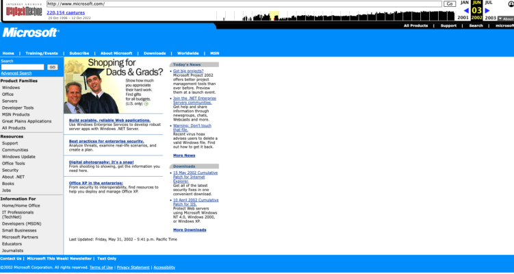
It's a fact that website design styles evolve rapidly from year to year, reflecting changes in technology, user behavior and aesthetics. Just think about how far websites have come since the early days of the late 1990's and early 2000's. Back then, websites were packed with dense information, featuring clunky elements like left side navigation, small text, minimal images and definitely no video. A quick trip to the Wayback Machine can offer a glimpse into that era’s chaotic, cluttered, and often confusing designs.
Here is a snapshot of microsoft.com from way back in 2002:
By today’s standards, those early websites are hard to imagine as functional, especially with modern design's focus on clarity, simplicity and seamless navigation. The emphasis now is on user-centric design, where every element serves a clear purpose and enhances the user experience. We’ve come a long way - and aren’t you glad?
Now here is microsoft.com in 2025:
Now let's explore at a few web design trends shaping 2025. There won't be a huge change from last year but there are some impactful innovations redefining what websites can do and how they look.
Trend #1: Bold colors, simplistic hero sections and dynamic interactions
In 2025, the shift toward bold simplicity continues to redefine website hero banners. Instead of traditional background images with overlay text, bold solid colors paired with striking typography and subtle animations have become the hallmark of modern design.
Subtle motion effects or gradient animations give your hero section a dynamic feel.
Large, bold typography paired with clean layouts ensures clarity and accessibility.
Strategic micro-interactions, like hover effects or interactive call-to-action (CTA) buttons, engage visitors without overwhelming them.
This trend aligns with the continued focus on minimalism and extreme contrast, but with added interactivity.
The goal is to capture attention instantly while making navigation intuitive. This approach eliminates the distractions of complex visuals, ensuring your core message stands out. It’s not just visually appealing - it’s functional and user-centric.
Trend #2: Story-centric design
Storytelling remains an essential element of web design in 2025, but it has evolved into a more immersive and interactive experience. Websites now guide users through tailored narratives.
Video-driven narratives: Include fullscreen videos or interactive video segments that walk users through your brand’s story, creating emotional connections.
The essence of storytelling hasn’t changed: it’s still about showing the customer’s transformation. However, the delivery has advanced, making the journey more compelling than ever. Pair these stories with testimonials, infographics and explainer videos to deepen the connection and emphasize real-world results.
Trend #3: Membership, courses and monetization
As creator-driven economies continue to thrive, websites are evolving into comprehensive hubs for monetization. In 2025, membership and course platforms have reached new levels of sophistication, offering seamless integration with diverse revenue streams. By uniting these monetization methods on a single platform, you can provide a versatile and engaging experience that caters to the varied needs of your audience, fostering loyalty while maximizing income potential.
Offer Tiered Memberships: Provide different membership levels with varying benefits (e.g., basic, premium, VIP) to cater to a wider audience.
Skill-Based Training: Develop in-depth courses on a specific skill or topic that appeals to your target audience.
More website owners are moving away from Facebook groups and other social media platforms to house their communities. The shift away from social media giants continues to gain traction in 2025 as creators and businesses reclaim control over their communities. Websites now serve as fully-equipped hubs for interaction and connection.
Built-in Forum: Many membership platforms now include built-in forums. SubHub's forum feature allows segmentation by member group, enabling restricted access for premium memberships or separate forums for different groups.
Member Directory: Members can create profiles with photos, videos, and text for others to search and view.
The takeaway for 2025
Website design in 2025 revolves around clarity, connection, and control. Bold visuals, immersive storytelling, monetization tools and community-building features will let your website deliver both a memorable experience and measurable results.
AI Tools in some ways are nothing new. Much of the marketing software that has been available for several years could be considered AI. But in the last couple of years, AI tools have come to mean something more useful and elaborate, especially when it comes to marketing.
As a membership website owner, you probably already spend a lot of time on marketing, so you know how important it is to a thriving business. Consistently getting new members to join your website is the most important mission you have, apart from consistently providing value to current members. Artificial intelligence (AI) can help. By using AI’s capabilities, you can create personalized experiences, fine-tune your marketing, and keep your website fresh and engaging. Here are 3 smart ways to harness the power of AI to keep your business growing.
Speak Directly to Your Visitor with Personalized Marketing
Everyone responds better to a personalized communication than a generic one. AI can look at data from social media, website activity, and even search habits to create tailored marketing messages. When your messages feel personal, people are more likely to pay attention and consider joining.
AI Tools: Facebook or Google ad campaign account, AdRoll to retarget ads based on user interactions with your website, Mailchimp to create personalized email campaigns, Google Analytics to track website visits.
Example: Dynamic advertising tools can be used to recommend your membership site to people based on their browsing history or preferences. For instance, if someone recently searched for "online fitness programs," an AI tool like AdRoll or Facebook retargeting ads could identify this and display an ad for your fitness-related membership site, highlighting its most relevant features. If the person seeing the ad clicks on it and ends up contacting you or signing up for something on your website, you can use the same information to target relevant emails to them. Google Analytics can track the process and record the conversion as well.
Find the Right Audience with Predictive Analytics
AI can help you figure out who is most likely to become a member by analyzing patterns in user behavior. This means you can focus on the people who are most interested in what you offer. AI-driven customer relationship management (CRM) tools can help you create targeted campaigns that really resonate.
Tools:Mailchimp for personalized email campaigns and audience segmentation, HubSpot CRM to identify the leads most likely to convert based on behaviour, Google Analytics to track user behaviour and identify engagement patterns, Pipedrive CRM.
Example: Customer relationship management tools like Pipedrive use AI to help you understand what your website visitors are doing and how you can use that information. It can grade leads by which are more likely to convert, and allow you to send personalized email campaigns and follow-ups.
For instance, someone who visits your pricing page multiple times and opens every email you send may be more likely to join your site. These tools can also remind you to follow up with leads at the right time, such as after they’ve completed your free trial but haven’t subscribed yet.
Let’s say you’re a nutrition membership website. AI tools can tell you if visitors are engaging with your website in the morning, in which case you could offer a “daily breakfast menu” to entice these potential members.
Turn Visitors Into Members with Chatbots
AI chatbots can answer questions, guide visitors through your site, and even help them sign up—all in real time. This instant interaction can make a big difference, especially if you have your chatbot offer free resources, like eBooks or webinars, to showcase the value of your membership.
Tools:There are multiple chatbots available, and most are easy to implement on your SubHub website. Simply add the provided embed code to your site and watch the magic happen! Popular chatbots are Intercom, Tidio, Drift, and ManyChat.
Example: Chatbots are smarter than you think. They can actually do a lot more than just tell your visitor to leave an email address and someone will get back to them. For instance, let’s say your membership website sells professional development courses. When a visitor lands on your site, a chatbot can ask a short series of questions. Based on the answers, the bot can direct your visitor to a particular article, course, or webinar. They can also handle common questions in real time. For instance, a visitor might ask “What’s included in the membership?”, “Can I cancel anytime?”, or “Do you offer discounts?” Your chatbot can provide instant, consistent answers, improving user experience and reducing bounce rates.
There you have it—three powerful ways to harness AI to attract and convert visitors into members, plus strategies to keep them engaged and coming back. No tool is foolproof, and AI doesn’t replace your expertise. But it can help you unlock your website’s full potential, making it more efficient and engaging at the same time. Start small, experiment with tools, and see how AI can elevate your membership website.
BONUS CONTENT: Quick Video - How to Install Tidio Chatbot into Your SubHub Website